The Paley Center for Media Brand Resources

The Paley Center for Media's graphic design system consists of two parts: Our basic identity guidelines and our house style guidelines. The identity guidelines provide detailed instruction on how to treat the basic elements of our visual style: lock-up, branded affairs/entities, color palette, and selected typefaces. Our house style expands upon our identity system to include a distinct photography style, gradient background treatments, a supergraphic, window device, and composition grid.

Because the consistent application of each of these elements is crucial to establishing credibility and recognition in our brand, we request that you follow these guidelines closely and with care. However, as you will see, this visual system was designed to allow creative flexibility in the generation of our branded materials.

In order to preserve the power of the brand the Paley Center logo must be correctly implemented. Rules on how to use this logo are fully explained below.

Paley Center Lock-up

The Paley Center for Media lock-up stands at the center of our graphic design system. The lock-up is our principal brand identifier, and it should be used whenever possible. The Paley lock-up assets are available as vector EPS, transparent PNG, and flat JPG.

Paley Center Lock-up (One-Line)

Black Vector EPS  White Vector EPS  Black Transparent PNG  White Transparent PNG  Black on White JPG

Paley Center Lock-up (Three-Line Stacked)

Black Vector EPS  White Vector EPS  Black Transparent PNG  White Transparent PNG  Black on White JPG

Lock-up Color Variations: The lock-up colors are one-color black, and full reverse against a color or photographic background. If you would like more information about specific color use, email the Creative Services Department.

Minimum Size: The Paley Center for Media lock-up can be reproduced in a range of sizes. However, at smaller sizes the lock-up risks losing its legibility. For this reason a minimum size has been established. The Paley One-Line lock-up must never be scaled smaller than 4’’ in width; Paley Three-Line lock-up must never be scaled smaller than 2" in width.

Background Control: The Paley Center for Media lock-up can be applied against a variety of backgrounds. In every instance, it is essential that the background provide sufficient contrast with the lock-up artwork to ensure its legibility. White is the generally preferred background for the primary lock-up in one-color black because of the crisp, clean contrast it creates. For dark and photographic backgrounds, the reverse lock-up variation should be applied.

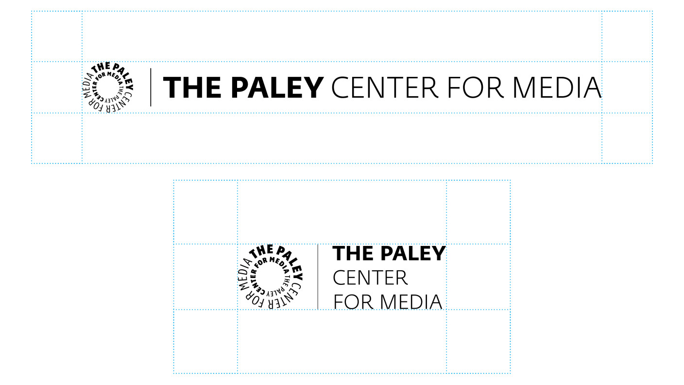
Clear Space: The Paley Center for Media lock-up must be surrounded by a generous field of clear space in every application. This isolates the lock-up from competing elements such as text and graphics and helps ensure its legibility and impact. The absolute minimum amount of clear space that can surround the lock-up is shown above.

Lock-up Misuse: Any misuse of the lock-up, no matter how small, diminishes the effectiveness of The Paley Center for Media lock-up and compromises the credibility of our brand. Under no circumstances should the lock-up ever be altered, added to, or re-created. Only use the approved digital art files and reference these guidelines often to ensure you treat the lock-up with care and consistency:

Never use anything but the approved and provided lock-up.
Never attempt to create your own Paley Center lock-up.
Never stretch or alter the lock-up's proportions.
Never attach anything to the lock-up.
Never use the lock-up as part of a sentence or phrase.
Never use the lock-up in a crowded space.
Never print on top of the lock-up.
Never rearrange the elements of the lock-up.
Never confine the lock-up in a shape.
Never re-typeset the lock-up.
Never gradate the lock-up.

Branded Affairs and Entities

Paley branded affairs and entities can be a standalone logotype or used with the circular mark as its own lock-up. Also city designation  "New York" (or "NY") can be placed at the end of the line. All of the same rules for the Paley Center lock-up apply to these branded affairs and entities. If you would like more information about using these branded logotypes as lock-ups, email the Creative Services Department.

Primary Typeface

As seen in our lock-up, typography is another central element of our identity. The consistent use of our selected typefaces not only references the brand, but also adds to a cohesive look and feel to all of our materials.

Fedra Sans Std complements the design of our lock-up. Its highly modern letterforms establish a distinct look and feel in our visual applications. It is intended for primary text applications on all communication materials.

Typography should never have effects applied to it such as distortions or blurs.

typeface-primary2.gif

TYPOTHEQUE

Secondary Typeface

Fedra Serif B is the natural extension to our primary typeface. Although its designs are contemporary and fresh, its stylized serifs suggest a classic look.

Highly readable even at smaller sizes, Fedra Serif B is intended for all secondary text applications such as body copy and captions. Fedra Serif B is also recommended on more formal communications such as letters and other correspondence.

Typography should never have effects applied to it such as distortions or blurs.

typeface-secondary2.gif

TYPOTHEQUE

Complementary & Supplementary Typefaces

Gotham is a family of widely used geometric sans-serif digital typefaces designed by American type designer Tobias Frere-Jones in 2000.

Gotham's letterforms are inspired by a form of architectural signage that achieved popularity in the mid-twentieth century, and are especially popular throughout New York City.

Gotham has a relatively broad design with a reasonably high x-height and wide apertures. This typeface works well with Fedra Sans in many weights and sizes.

gotham type specimen2

TYPOGRAPHY


Open Sans is a humanist sans-serif typeface designed by Steve Matteson and commissioned by Google.

Featuring wide apertures on many letters and a large x-height (tall lower-case letters), the typeface is highly legible on screen and at small sizes. It belongs to the humanist genre of sans-serif typefaces, with a true italic. It was released in 2011.

According to Google, it was developed with an "upright stress, open forms and a neutral, yet friendly appearance" and is "optimized for legibility across print, web, and mobile interfaces."

open sans type specimen

GOOGLE FONTS

Color Palette

The consistent use of standard colors will help in the recognition of the Paley Center visual communications. A color palette has been specifically developed to contain five colors that allow for diversity of the Paley Center look and feel. A guiding principle of communications is quality and consistency, while allowing for design flexibility. The Paley Center color palette allows for that flexibility while still delivering a consistent message.

The Paley Center color palette has been chosen so that when printed in four-color process the Pantone® equivalent is very similar. Four-color process printing, known as CMYK, uses up to four component colors to make a match of a standard Pantone® color. These components are 'C' for 'Cyan', 'M' for 'Magenta', 'Y' for 'Yellow', and 'K' for Key or Black. Four-color process printing will generally produce a less vivid color than the standard Pantone® spot color.

The five colors may be used as solid colors only. These colors accent the primary logo, and when printing in one color only, black is the preferred color. The color palette allows for RGB color variations for electronic presentation materials.

DOWNLOAD SWATCH

Primary Colors

Color is a key element of our visual identity. The Paley Center for Media relies on a mix of vibrant and energetic colors in addition to black, white, and gray to provide a range of design possibilities.

These colors can be applied to a variety of graphic elements, including backgrounds, text, rules, charts, graphs, and the logo in specific applications.

Keep in mind that a single-color treatment (using the same color for the logo, text and window device against a white background) is one of our key design concepts. This promotes a clean and consistent look and feel.

Using a number of colors in a layout, such as using color text against a background of a different color, should always be avoided. As special projects arise new colors may be incorporated into the existing palette, ensuring that the new color is consistent with the overall value of the identity of the Paley Center.

pms382-chip.gif   pms144-chip.gif   pms214-chip.gif   pmscyan-chip.gif   pms2725-chip.gif

Paley Green
Pantone® 382
C 28% M 0% Y 92% K 0% :: R 195% G 217% B 64% :: Hex #C3D940

Paley Orange
Pantone® 144
C 0% M 52% Y 100% K 0% :: R 233% G 131% B 0% :: Hex #E98300

Paley Magenta
Pantone® 214
C 0% M 100% Y 24% K 4% :: R 201% G 0% B 98% :: Hex #C90062

Paley Cyan
Pantone® Process Cyan
C 100% M 0% Y 0% K 0% :: R 0% G 159% B 218% :: Hex #009FDA

Paley Purple
Pantone® 2725
C 76% M 70% Y 0% K 0% :: R 100% G 89% B 196% :: Hex #6459C4

Gradient Colors

The gradients, contain the full spectrum of colors, are distinctive background color treatments. As shown in the examples, each gradient is a progression of three dedicated colors that progress from the upper-right corner of a layout.

This suggests a source of illumination, the wide scope of media and conceptually references the spectrum of offerings found at The Paley Center for Media.

The orientation of the gradients will need to be adjusted for applications with non-standard dimensions, such as those that are taller than they are wide. In these instances, it is necessary to stretch the gradient to form a rectangle. In doing so, the angle of the gradient should remain a 45 degree angle.

The gradients can be used as background applications. When used, the lock-up should always appear in reverse, along with text and other visuals such as the window. Additionally, the gradients can be applied over black-and-white photography for a stylized look and feel.

gradient2.jpg   gradient1.jpg   gradient3.jpg

These gradients are specially graded with the main Color Palette and should NEVER be recreated. Never use gradients other than the three examples shown. Contact the Creative Services Department for these official color gradients and their appropriate usage.

Submitting Art and Images to Paley

YOU MUST FOLLOW THESE GUIDELINES BEFORE SUBMITTING IMAGES.

We cannot use images saved in QuickTime, embedded in Word or PageMaker files. No AOL image attachments. If you are sending files in any other formats or have additional questions, please contact the Creative Services Department.

USING VECTOR VS. PIXELATED ART

VECTOR ART—Adobe® Illustrator® Formats (.ai and .eps): The AI and EPS formats are for applications that require high-resolution artwork for reproduction: for example, anything that is press printed or for large scale projects such as banners or signage. Adobe Illustrator art can be proportionally scaled (enlarged and reduced) without degradation in quality. 

PIXELATED ART—JPEG, PNG, PSD Formats (.jpg, .png, or .psd): JPEG/PNG/PSD art are suitable for digital and video use: for example, Internet use, e-mail, slideshows, and video presentations. Also they can be proportionally reduced, but must not be re-enlarged because distortion and or re-rasterization of the art will occur.

ART & IMAGE DIMENSIONS

A. HORIZONTAL KEY ART: 3840 x 2160 px (16:9 aspect ratio)
B. SQUARE KEY ART: 3840 x 3840 px (1:1 aspect ratio)
C. VERTICAL KEY ART: 2160 x 3840 px (9:16 aspect ratio)

THIRD PARTY WEB BANNER ADS

A. 970 x 250 translates to our desktop banner as 3840 x 990
B. 300 x 250 translates to our mobile banner as 818 x 682

SHOW KEY ART • PROGRAM STILL

Layered PSD Format with a lot of surround background so it can work in vertical/horizontal spaces (see below).
JPEG or PNG acceptable without show or network logos.

SHOW LOGO • PROGRAM TITLE

Adobe® Illustrator® AI or EPS VECTOR Format
PNG white text on transparent background acceptable

NETWORK / THIRD-PARTY LOGO

Adobe® Illustrator® AI or EPS VECTOR Format
PNG white text on transparent background acceptable at least 1600 px width

A square art that has a lot of surround space around the main object or key art will allow for use in HORIZONTAL and VERTICAL spaces in the above dimensions.

As a general rule of thumb, we require key pixelated art to be as high rez as possible, preferably in layered PSD format. A physical 8" x 10" photo is acceptable and will be scanned with an in-house flatbed scanner.

If you are submitting art for the purpose of offset printing, please be sure that the art is saved as four-color separation, or CMYK format, along with its original RGB format. Please use WeTransfer for any art larger than 5mb. We also use Dropbox for sharing of assets, please email the Creative Services Department if you need more information.

Brand History

In honor of Lou Dorfsman, the legendary director of design at CBS under William S. Paley who became the design director at the then Museum of Television & Radio in 1991, Creative Services has made this timeline showing the evolution of the brand identity for The Museum of Broadcasting into The Paley Center for Media.
PALEY MTR MB HISTORY 052118 2
PALEY MTR MB HISTORY 052118 6


In concert with Paley President & CEO Maureen J. Reidy, in-house Design Director Jack CK Chen takes the next step in the evolution of the main mark: the Clearview font is replaced with Fedra Sans. Now the entire system—from the original circular mark throughtout the branded affairs and branded entities—is a unified typography. For the institution's name, this evolution brings an important, consistent graphic empashs: the words The Paley are most always bold, across all configurations. The brand DNA allows for variations where the components of the lock-up are used independently, with middle to left alignments.

PALEY MTR MB HISTORY 052118 5